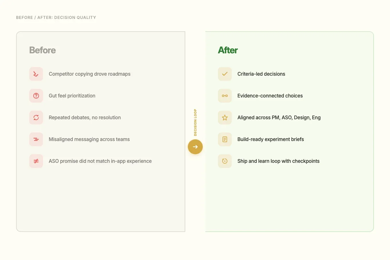
Replaced gut-feel decisions with a repeatable loop across an 8-app subscription portfolio.
A fast-shipping app studio could build quickly, but portfolio decisions still ran on competitor copying and gut feel. I built a repeatable decision loop—connecting market signals, user evidence, and delivery planning—so the team could choose better bets across onboarding, paywalls, and retention.
Situation
An app studio shipping 8 subscription products was making portfolio decisions based on competitor copying and gut feel. Speed wasn't the problem, decision quality was.
Role
UX Researcher & Senior UX Designer (consultant), owned evidence synthesis, hypothesis framing, and decision workshops
Key decision
Built a repeatable decision loop connecting market signals, user evidence, and delivery planning, so trade-offs were explicit before engineering committed effort.
Outcome
Prioritization shifted from opinion to criteria. Cleaner experiment briefs. Fewer repeated debates across 4 teams and 8 apps.
TL;DR
A Barcelona app studio could ship fast across 8 subscription products — but “what to build next” still ran on competitor copying and internal opinion. With external delivery partners, high churn risk, and no shared criteria, the same debates kept recurring sprint after sprint.
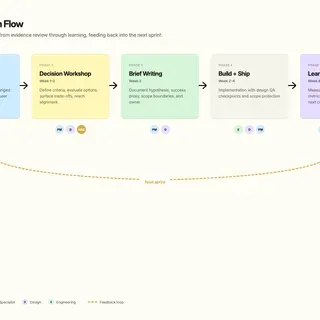
I built a decision system that connected market signals, user evidence, and delivery planning. Each phase fed the next: mapping surfaced gaps, evidence filled them, findings became scored hypotheses, and workshops turned hypotheses into owned decisions with build-ready briefs.
Context
In 2024–2025, I worked with a Barcelona app studio running a portfolio of B2C subscription products. The growth model depended on speed in mature categories where user expectations were already high.
The main risk was not shipping pace. The risk was decision quality. Without shared criteria, teams would keep moving fast but invest in weak bets, create rework, and dilute product positioning.
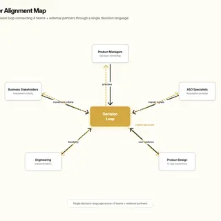
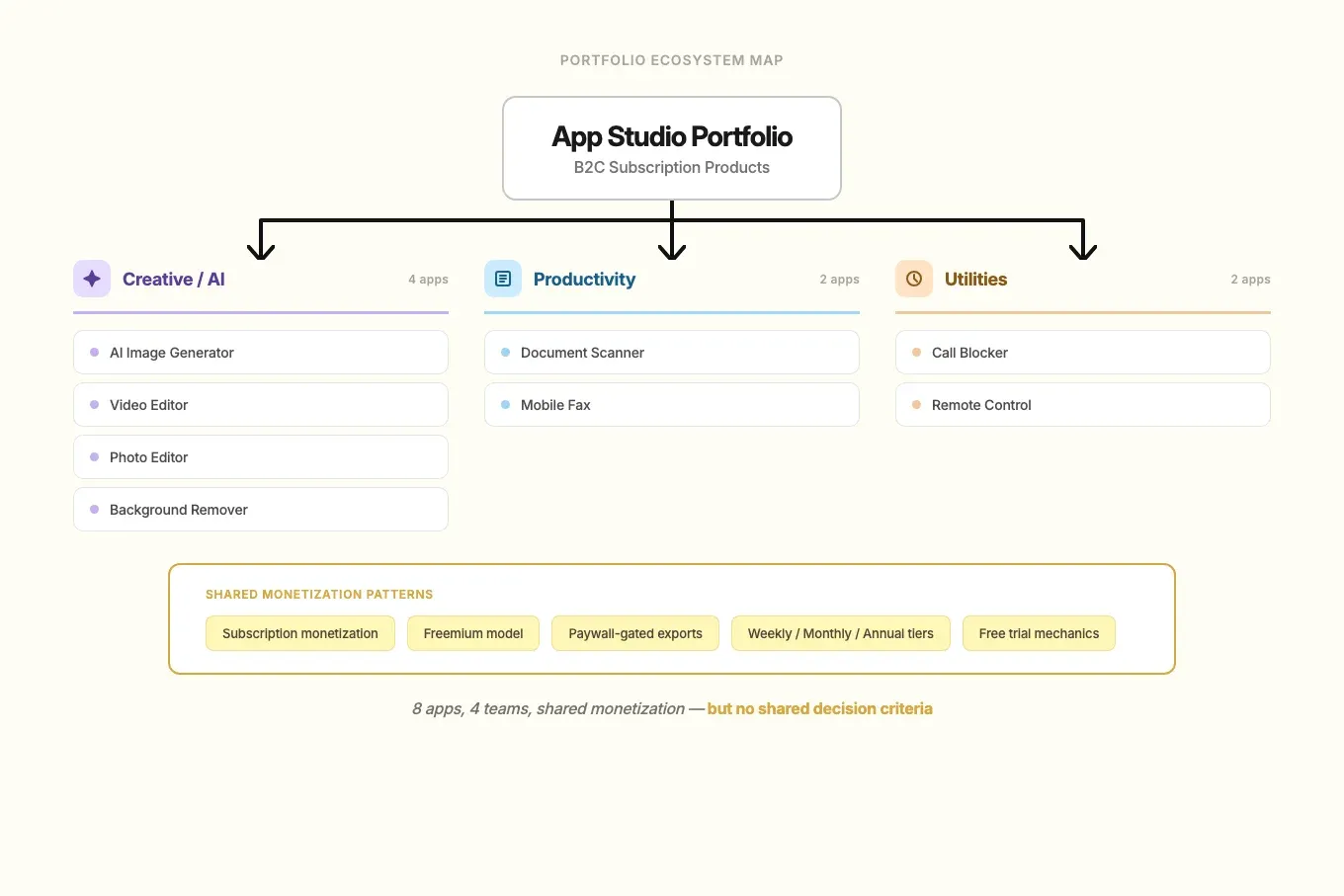
The business needed confidence on where to invest next. Product managers needed prioritization clarity, ASO needed claims that held up in-product, design needed a coherent direction, and developers needed decision-ready briefs. There were plenty of competitors to benchmark, but no proven system for aligning decision quality across eight apps, four teams, and external delivery partners.
My Role & Team
I worked as a UX Researcher and Senior UX Designer consultant across the portfolio.
- My scope: competitor benchmarking, review mining, targeted qualitative research, CRO hypothesis framing, and decision workshops.
- Decision ownership: I owned how evidence became decision options, criteria, and implications.
- Core collaborators: product managers, ASO specialists, product designers, developers, and business stakeholders.
Constraints
- Eight apps, one process: deep per-app discovery was not feasible. The decision framework had to work at portfolio level while still respecting category differences.
- External delivery partners: implementation happened outside the core team, so briefs needed to be complete and unambiguous before handoff.
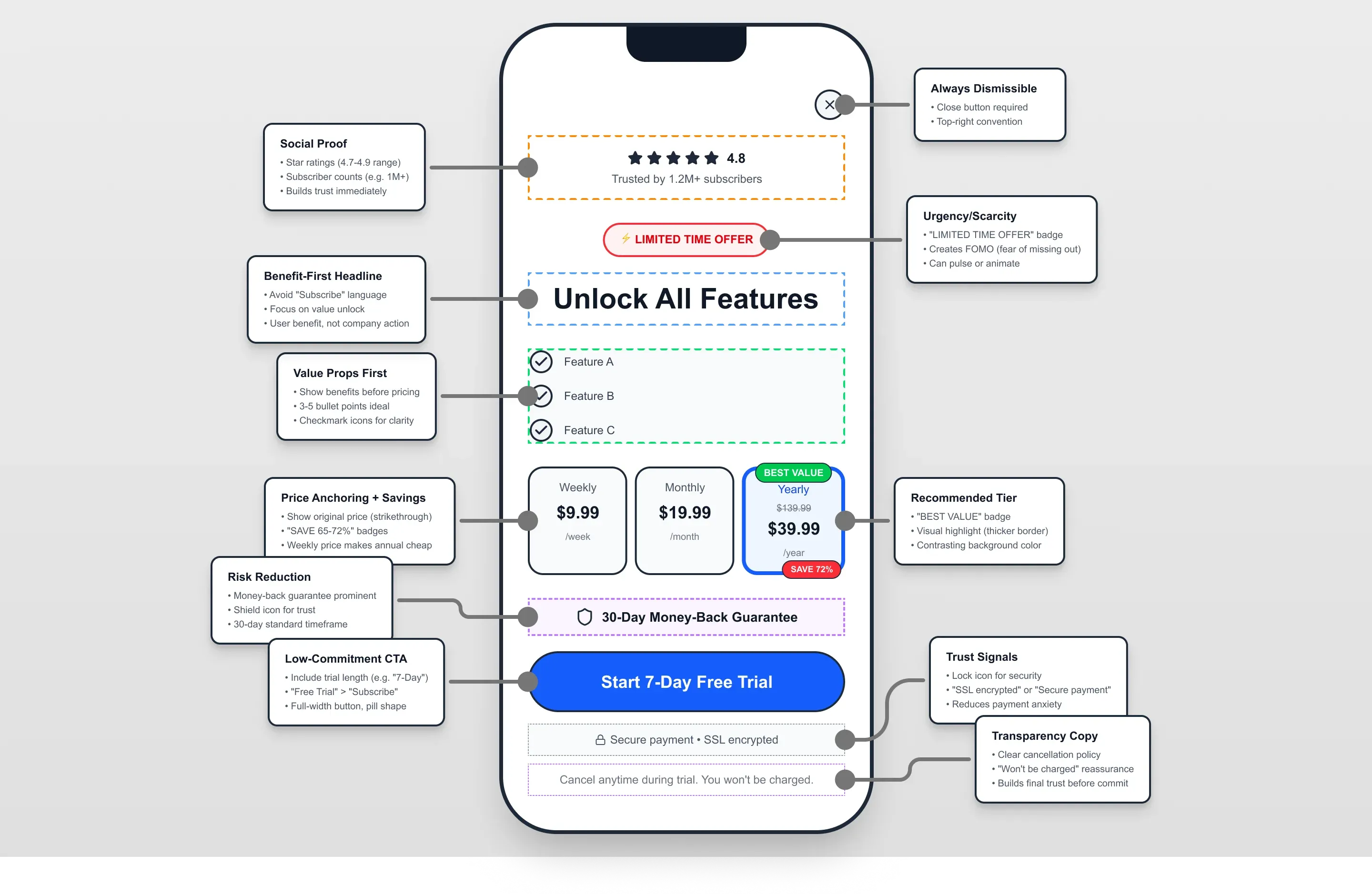
- Subscription trust risk: any change to onboarding, paywalls, or messaging carried churn risk. Evidence had to come before execution.
- NDA: product names, screenshots, and brand details are anonymized throughout this case study.
Approach
I structured the work to reduce uncertainty before teams committed engineering effort. Each phase fed the next: mapping surfaced where evidence was weakest, evidence collection focused on those gaps, findings became scored hypotheses, and workshops turned hypotheses into owned decisions.
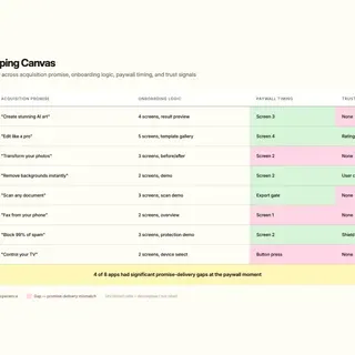
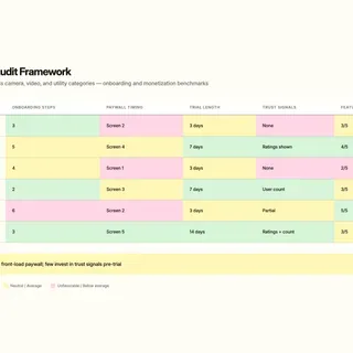
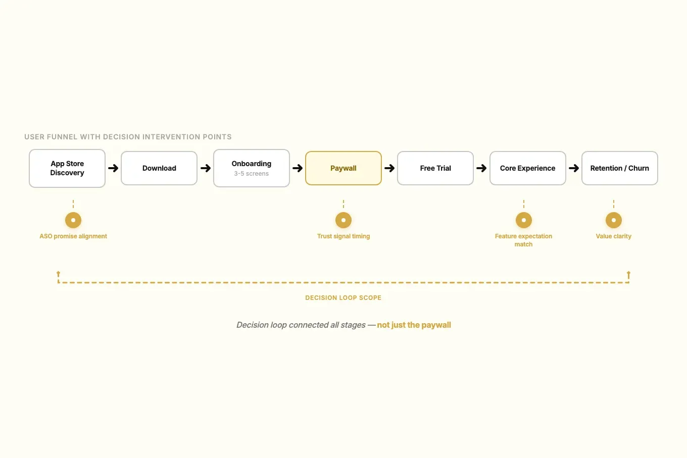
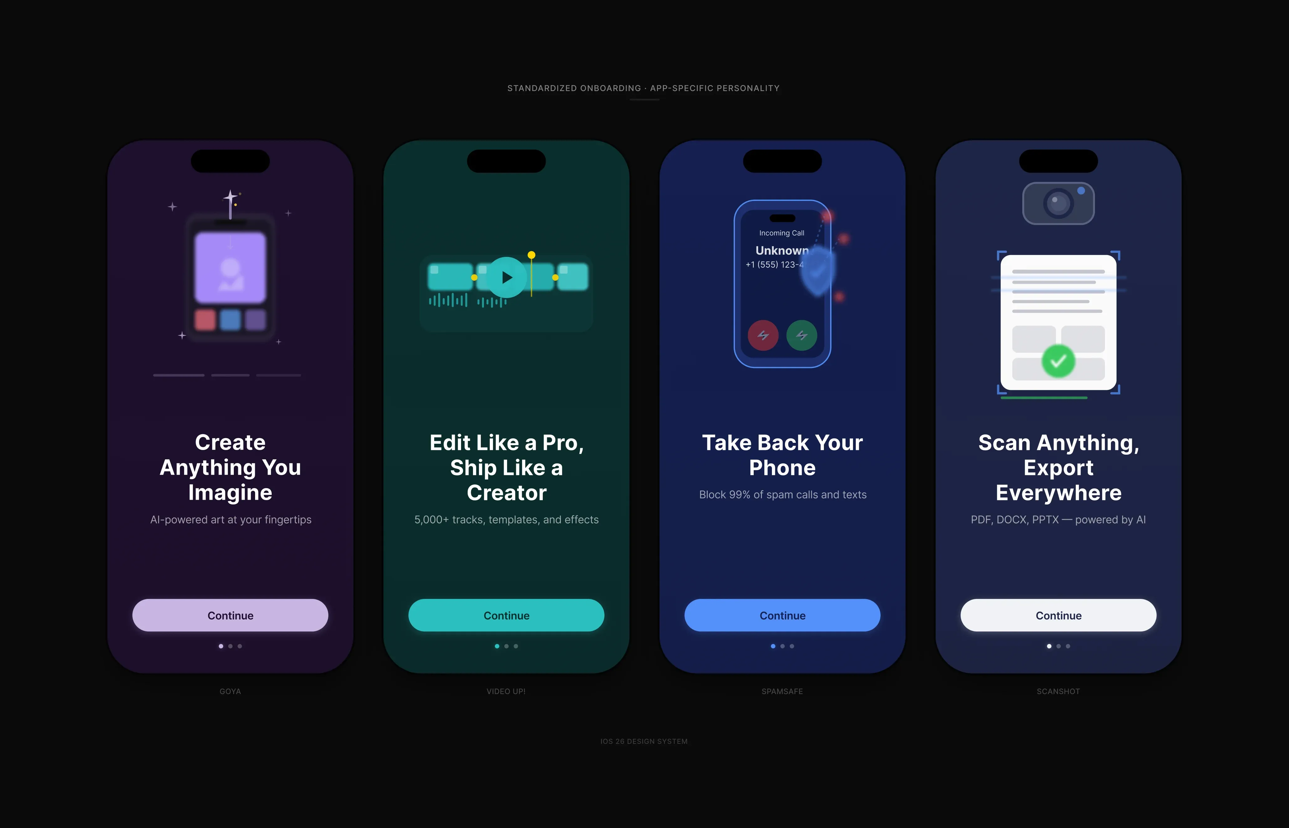
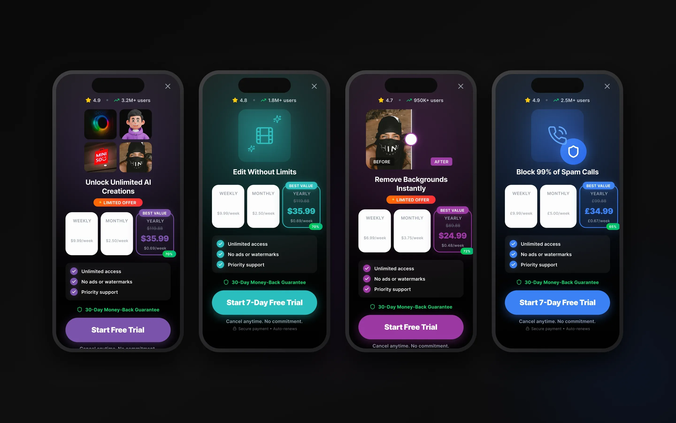
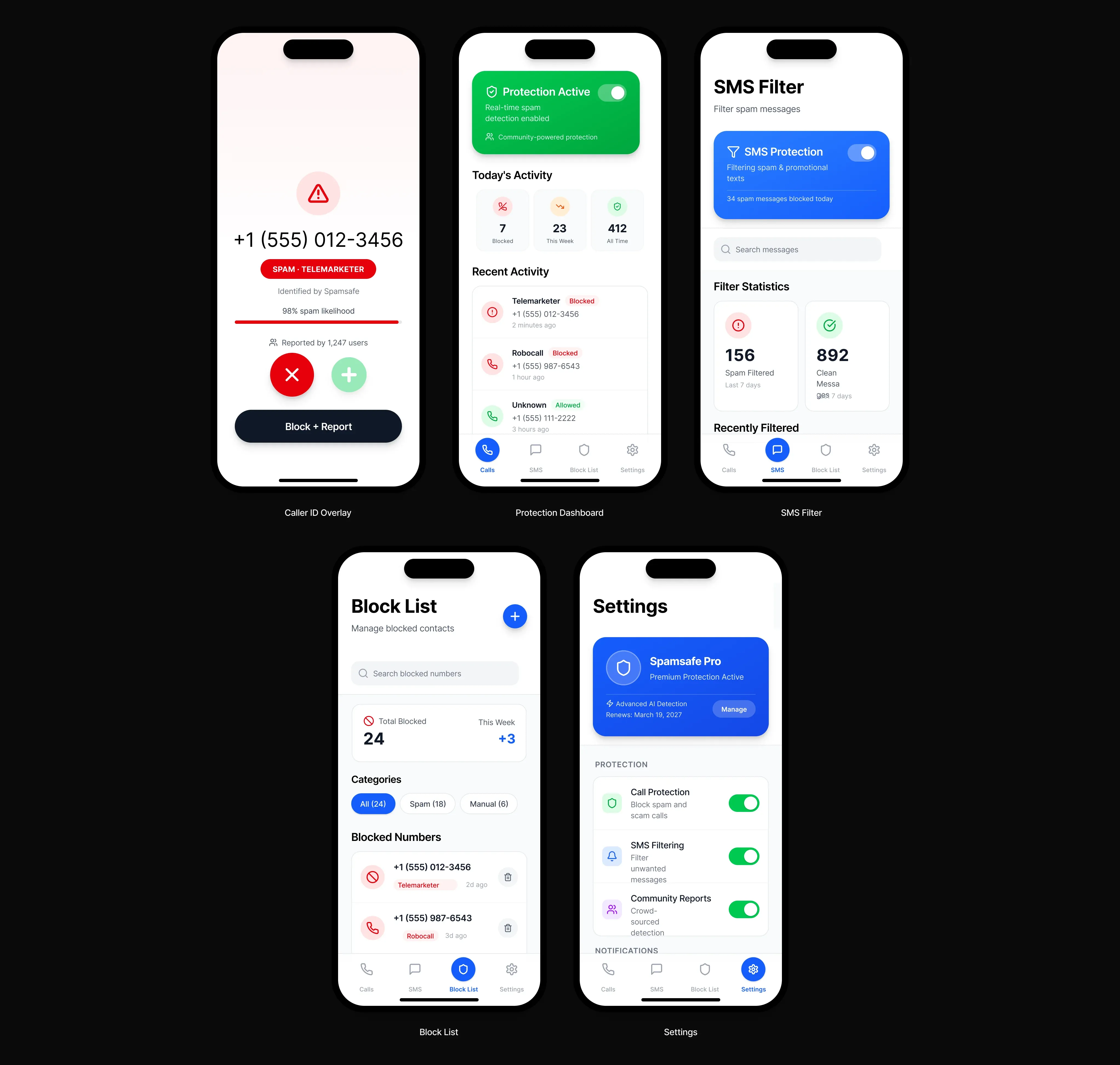
- I mapped each app category by acquisition promise, onboarding logic, paywall timing, and trust signals.
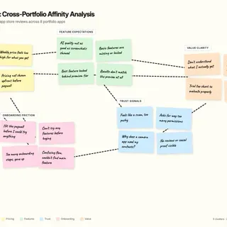
- I combined review patterns with focused interviews and usability checks at the highest-friction funnel moments.
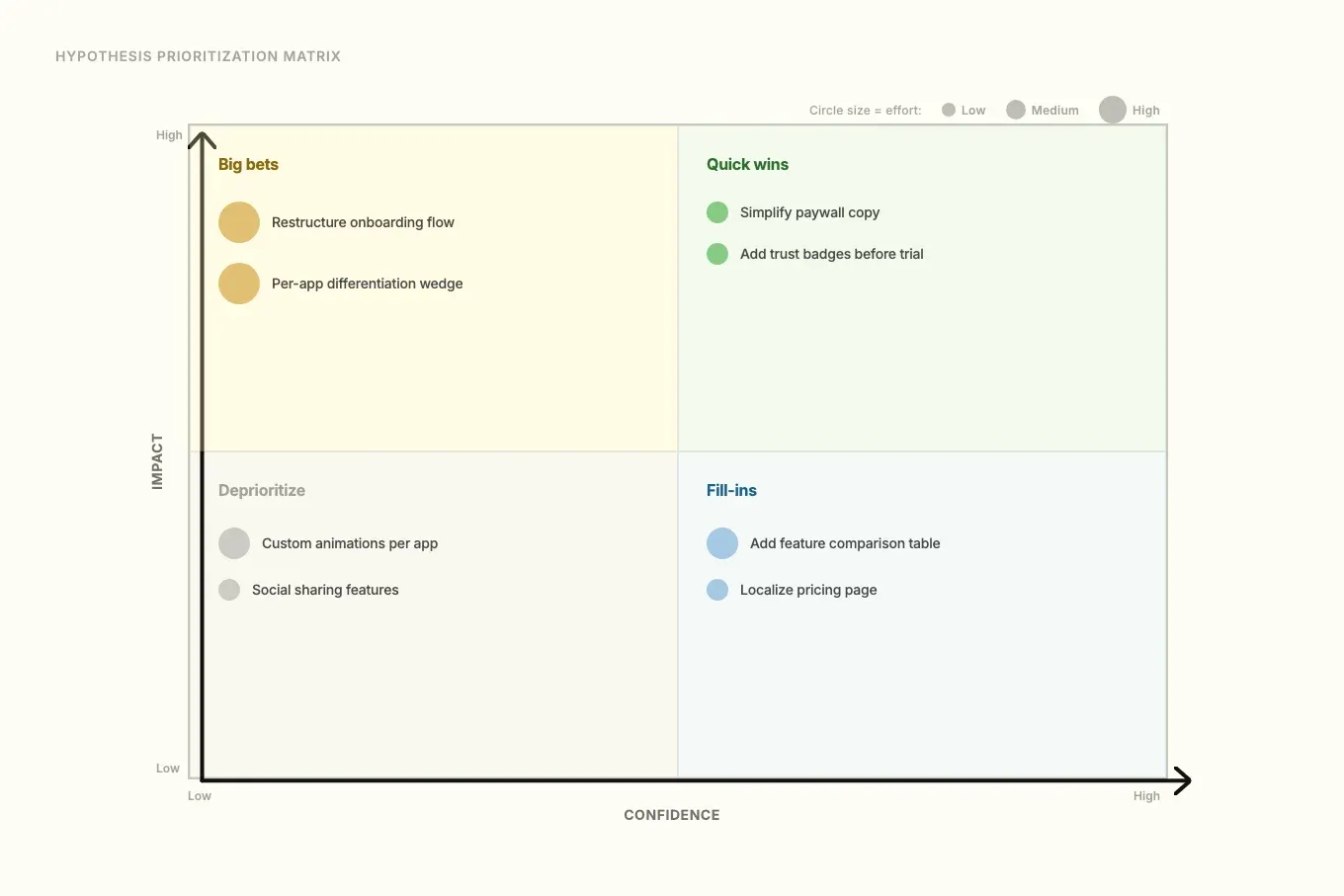
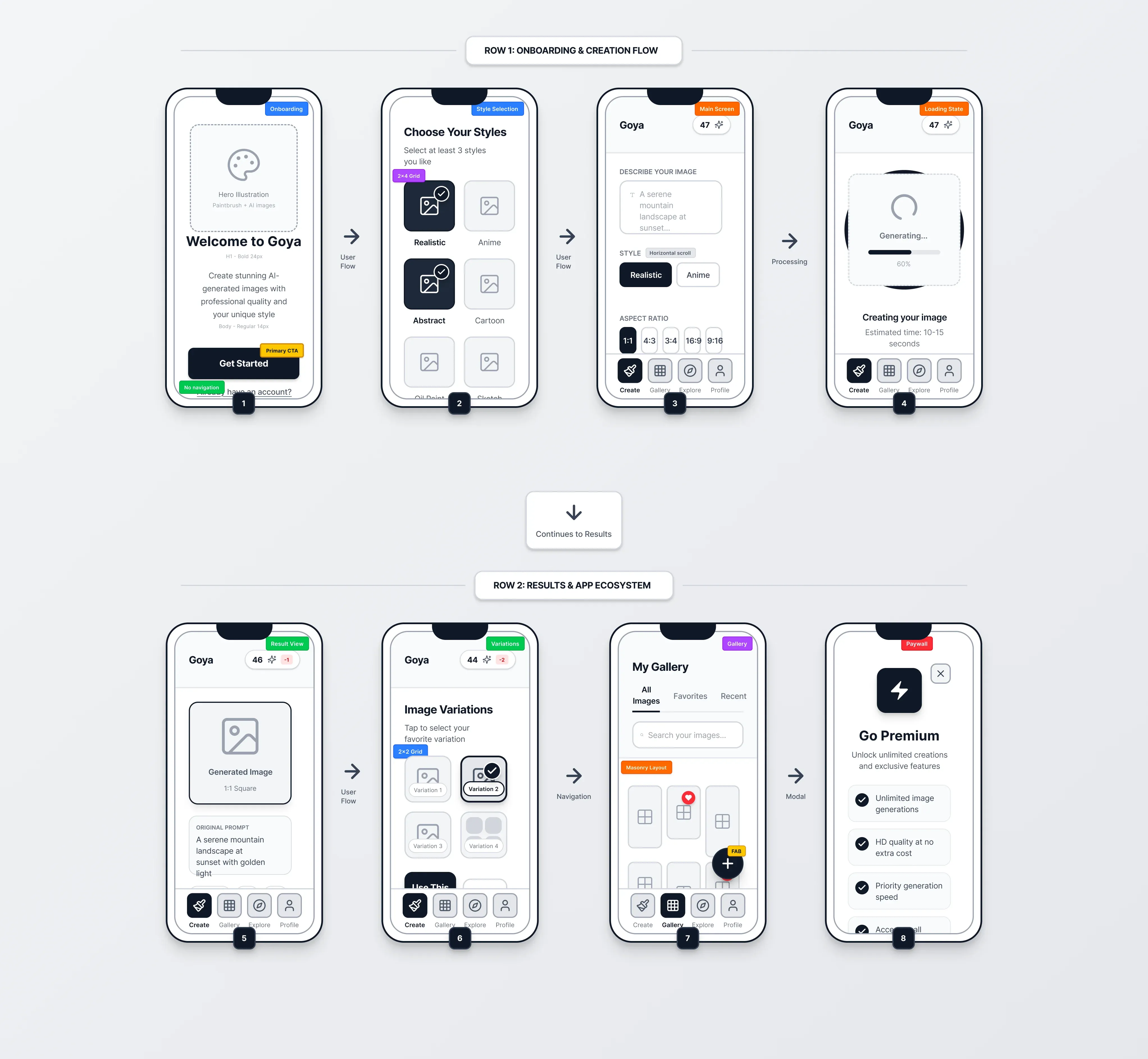
- I translated findings into a hypothesis backlog with impact, confidence, effort, and observable evaluation proxies.
- I ran decision workshops with product, ASO, design, and engineering to make trade-offs explicit and keep execution aligned sprint to sprint.
This sequencing meant every change had a clearer reason, owner, and success proxy before build.
Process at a glance
| Phase | What it clarified | Output (decision tool) |
|---|---|---|
| Portfolio mapping | What each app promised vs what it delivered | Category map: onboarding, paywall timing, trust signals |
| Evidence synthesis | What users and the market were actually saying | Review themes + targeted qualitative findings |
| Hypothesis backlog | What to test first (and why) | Prioritized hypotheses with impact/confidence/effort + evaluation proxies |
| Decision workshops | Cross-functional trade-offs and ownership | Agreed options + build-ready briefs for delivery |
          flowchart LR
subgraph Evidence["Evidence gathering"]
  A["Signals<br/>market + App Store"] --> B["Evidence<br/>reviews + interviews + usability"]
end
subgraph Decision["Decision making"]
  B --> C["Options<br/>hypotheses + criteria"]
  C --> D["Choose<br/>impact · confidence · effort"]
  D --> E["Agree<br/>trade-offs + ownership"]
end
subgraph Execution["Execution"]
  E --> F["Brief<br/>ready to build"]
  F --> G["Ship + learn<br/>what changed"]
end
G --> A
G -.->|"pattern promotion"| H["Portfolio default<br/>tested → standard"]
H -.-> C
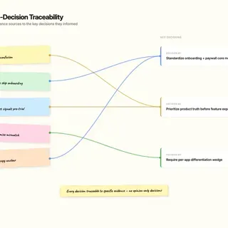
Key Decisions & Trade-offs
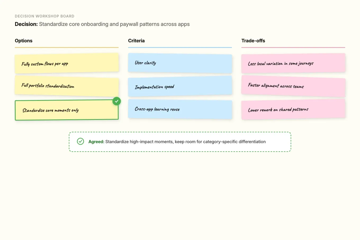
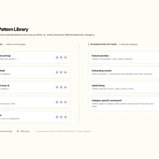
- Decision: Standardize core onboarding and paywall patterns across apps while keeping room for category-specific differentiation.
- Options considered: Fully custom flows per app; full portfolio standardization; standardize only high-impact core moments.
- Criteria used: User clarity, implementation speed, and cross-app learning reuse.
- Trade-off accepted: Less local variation in some journeys.
- Result: Faster alignment and lower rework without flattening each product’s positioning.
- Decision: Prioritize product truth and expectation clarity before adding more feature modes.
- Options considered: Expand feature breadth quickly; improve perceived quality and control first; split effort evenly.
- Criteria used: Review themes, conversion risk at paywall moments, and likely retention impact.
- Trade-off accepted: Slower short-term feature expansion.
- Result: Better match between what users were promised and what they experienced.
- Decision: Require an explicit differentiation wedge per app instead of default parity roadmaps.
- Options considered: Competitor parity first; one shared portfolio strategy; per-app wedge with documented rationale.
- Criteria used: Defensibility, relevance to user pain, and delivery feasibility.
- Trade-off accepted: Some short-term keyword opportunities were deprioritized.
- Result: Clearer portfolio choices and stronger decision discipline.
Impact
- Qualitative outcomes:
- Prioritization moved from opinion-led conversations to criteria-led conversations.
- Cross-functional decisions got faster because trade-offs were explicit early.
- Handoffs to developers improved through clearer experiment briefs and success proxies.
- ASO messaging and in-product experience became more consistent, which reduced expectation gaps.
- Stakeholders could reference the same criteria when debating priorities across apps.
What I Learned / What I’d Do Next
I learned that strategic value in fast app studios comes from decision discipline, not design volume. When product, ASO, design, and engineering align on criteria early, teams ship with more consistency and less friction.
Next, I would formalize this into a lightweight portfolio operating model: shared instrumentation standards, recurring cross-app decision reviews, and clearer thresholds for promoting a tested pattern to portfolio default.
Project Media & Screenshots