
Guided an EU institution on how to make their technology guide actually useful for the people landing on it.
Specialists were landing on a public-sector technology guide and leaving before starting real discovery. I audited the experience as an information retrieval product and delivered a phased improvement plan—wireframes, acceptance criteria, and a governance direction for reuse via search and AI assistants.
Situation
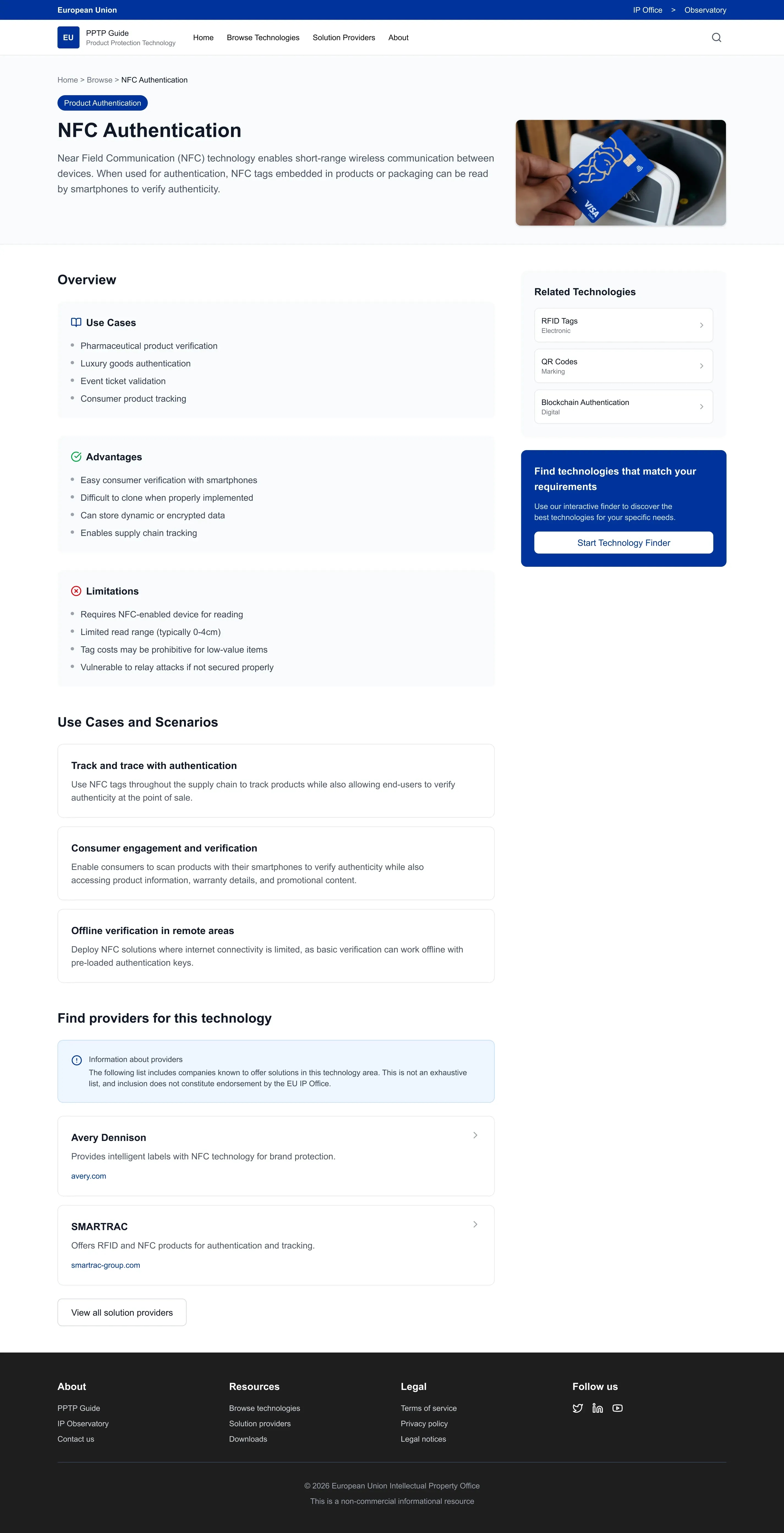
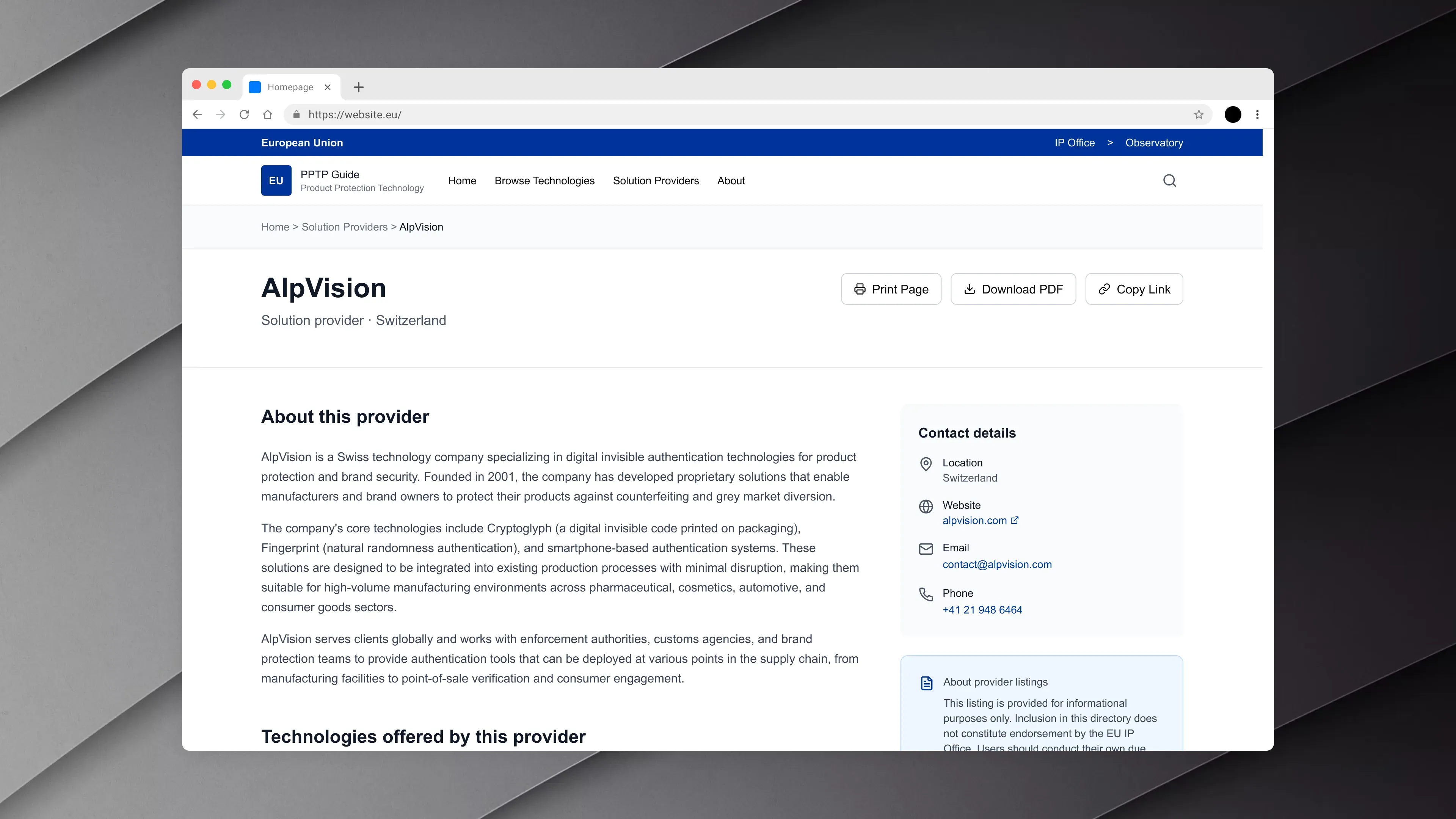
Specialists landed on a public-sector technology guide and left before finding what they needed. The guide wasn't structured for scanning, comparison, or clear next steps.
Role
Senior UX Consultant, owned analysis, wireframes, and phased roadmap
Key decision
Treated the guide as an information retrieval product, not a set of pages, recentered the experience on guided discovery instead of institutional 'About' content.
Outcome
Phased roadmap with wireframes and acceptance criteria. Governance direction for AI and search reuse, without adding an AI feature.
TL;DR
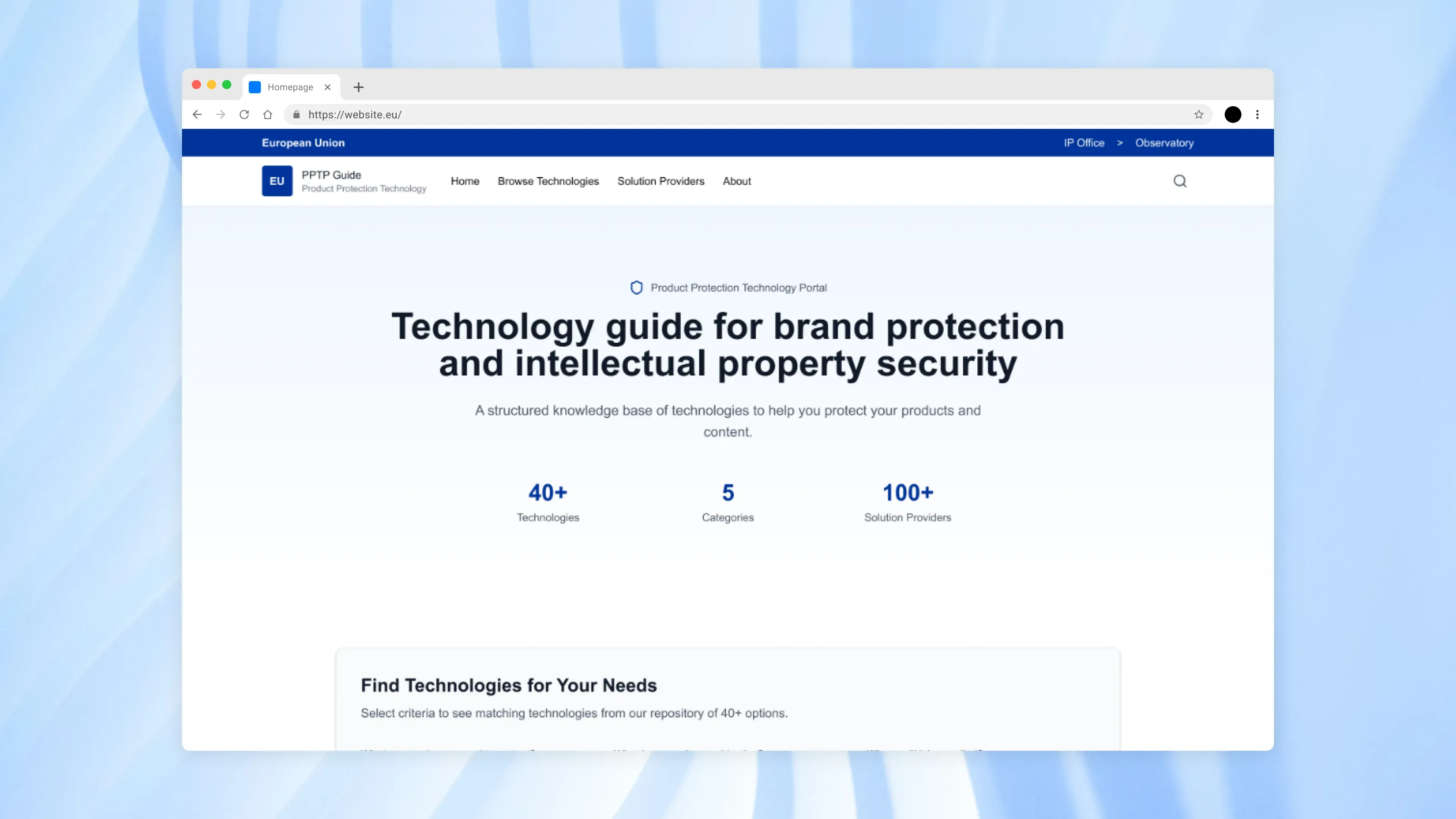
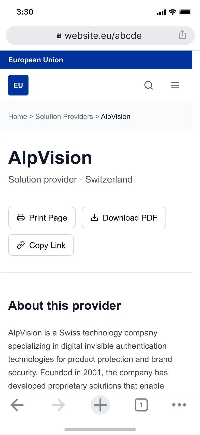
An EU observatory published a technology guide for specialists. People landed — often on mobile — and left before starting any real discovery. The pages weren’t structured for fast scanning or comparison, and the guide sat on a different tech stack from the parent portal, limiting what could change.
I audited it as an information retrieval system: where do people get stuck, and what’s the simplest path to “start discovering”? The result was a phased roadmap (Now / Next / Later) with wireframes and acceptance criteria — plus a governance direction so the guide stays trustworthy when AI assistants and search engines reuse it.
Context
In late 2025, I supported a public-sector technology guide linked from an EU-level observatory portal.
The risk wasn’t aesthetics. It was trust and decision quality: if specialists can’t quickly find, interpret, and compare technologies, they either abandon the guide or act on partial understanding.
A second risk was emerging at the same time: people increasingly “read” public information through intermediaries—search results with generative summaries, assistants, and research agents. The guide could be reused as a source, but without structured content and exports, third parties could repackage information on their own terms, weakening institutional authority.
My Role & Team
I owned the UX analysis and the recommendation set:
- Prioritization: What to change first vs defer.
- Executability: Wireframes + acceptance criteria so delivery teams could implement without re-litigating decisions.
- Collaboration: Worked with a service delivery manager inside the delivery consortium.
Constraints
- Platform governance: The parent portal’s templates/navigation were out of scope; the guide had to improve within its own surface area.
- Technical separation: The portal and the guide run on different stacks/hosting, limiting shared components and cross-site integration.
- Delivery sequencing: Desktop was prioritized for the first implementation iteration; mobile issues were captured for later phases.
- Scope control: General keyword search was intentionally kept stable in the quick-win phase to reduce delivery risk.
- Public-sector trust: Accessibility, consent, and analytics transparency needed to align with established patterns while improving clarity and confidence.
Approach
I treated the guide as an information retrieval product, not a set of pages.
Entry → orientation → discovery → comparison → next step.
The goal was to increase confidence at each step and remove false choices that distract from the core task.
To reduce uncertainty quickly, I used existing signals (analytics summary + heuristics + content/IA review) to identify where users were dropping off, then focused the first recommendations on “getting into discovery” rather than redesigning deeper pages first.
Finally, I made the output executable: wireframes that demonstrate hierarchy and flows, and a phased roadmap (“Now / Next / Later”) with definitions of done so delivery teams can ship without re-litigating the same decisions.
          timeline
Scope : Agree goals and constraints
Evidence : Find where people get stuck
Decisions : Prioritize what to fix first
Wireframes : Show the proposed structure
Roadmap : Define Now / Next / Later
          flowchart LR
A["Arrive<br/>What is this guide for?"] --> B["Find<br/>Where do I start?"]
B --> C["Compare<br/>How do options differ?"]
C --> D["Next<br/>What do I do now?"]
Most recommendations fell into three plain buckets: start discovery faster, make options easy to compare, and keep the information trustworthy over time.
Key Decisions & Trade-offs
-
Decision: Make guided discovery the primary Home entry; demote “About” from a primary call-to-action.
- Options considered: Keep “About” prominent; fold essential context into Home and route users into discovery first.
- Criteria used: Reduce early exits, increase task initiation, and align the first screen with the guide’s purpose.
- Trade-off accepted: Communications/Legal still need a formal “About the guide” destination, but it cannot compete with task entry.
- Result: Home becomes a launchpad into discovery (guided flow, map, list), especially critical on mobile.
-
Decision: Treat the parent portal as a fixed frame; strengthen “sense of place” via mirroring patterns and a local breadcrumb “IA bridge.”
- Options considered: Deep platform integration; local alignment inside the guide (without platform integration).
- Criteria used: Feasibility within scope, reduced dependency on platform governance, and clearer orientation for deep-link landings.
- Trade-off accepted: The breadcrumb is local to the guide; a fully shared cross-site breadcrumb is a later-phase recommendation.
- Result: Users understand the relationship to the wider portal without requiring technical unification.
- Decision: Define “AI readiness” as governance + structure (templates, semantics, exports), not as adding an AI feature.
- Options considered: Add AI UX features; do nothing; build a structured source of truth that can be referenced reliably.
- Criteria used: Preserve institutional authority, reduce inconsistent third-party repackaging, and improve retrieval via both humans and agents.
- Trade-off accepted: Structured export work sits in “Next/Later” and needs a separate decision and budget.
- Result: A pragmatic path to being an authoritative reference in an agent-mediated world, without betting on a chatbot.
          flowchart TB
portal["Parent portal<br/>(fixed frame)"] --> guide["Technology guide<br/>(improved)"]
search["Search<br/>or deep links"] --> guide
user["Specialist user"] --> guide

guide --> c1["Start discovery<br/>quickly"]
guide --> c2["Easier to scan<br/>and compare"]
guide --> c3["Clear trust<br/>signals"]
Impact
          timeline
Now : Start discovery easily (Home + orientation)
Next : Detail pages that support comparison
Later : Templates, taxonomy, and simple exports
- Delivered intermediate and final UX improvement reports with wireframes to bridge findings to development without ambiguity.
- Produced a phased roadmap (“Now / Next / Later”) with acceptance criteria, enabling prioritized delivery under scope and platform constraints.
- Reframed key UX issues as decision-quality problems (orientation, task initiation, comparison, “what next”), tying recommendations to observable drop-off patterns.
- Established a governance-oriented “AI-ready knowledge base” direction: structured templates, semantics, and simple exports so the guide remains consistent when reused through search and AI assistants.
What I Learned / What I’d Do Next
What I learned: In public-sector products, trust isn’t only visual consistency—it’s provenance, structure, and predictable reuse. When content is increasingly consumed through intermediaries, the organization’s real “product” becomes the reliability of its reference model.
The long-term value is operational: a repeatable way to publish and maintain information so it stays trustworthy when reused.
          flowchart LR
A["Standard template"] --> B["Write / update"]
B --> C["Review"]
C --> D["Publish"]
D --> E["Reuse (search + assistants)"]
E --> F["Fix drift"]
F --> A
What I’d do next: Formalize governance around the guide as an authoritative source:
- Define a structured content model (templates + taxonomy).
- Specify machine-readable exports/schema for the highest-value content.
- Set provenance and maintenance rules so information stays consistent when consumed via search and AI assistants.
Project Media & Screenshots