
Redesigned Spain's largest online supermarket — from legacy platform to a new e-commerce experience.
Carrefour Spain needed to modernize its online supermarket, but the experience was fragmented across business verticals and locked to a legacy platform. I led the UX and service design work—research, information architecture, tested prototypes, and cross-team alignment—that contributed to +20% online sales after launch.
Situation
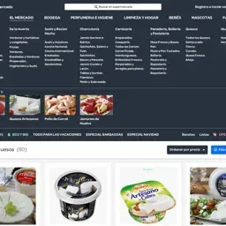
Spain's largest online supermarket had 6 business verticals building 6 different shopping experiences on a legacy platform nobody wanted to touch.
Role
UX and Service Design Consultant (via Machiina), owned discovery, IA, prototyping, and cross-team alignment
Key decision
Led with information architecture before any visual refresh, validated flow changes with prototypes and user testing before committing development.
Outcome
+20% online sales after launch. Checkout completion up 12%. Cart abandonment down 15%.
TL;DR
Spain’s biggest supermarket had six teams building six different shopping experiences on a platform nobody wanted to touch. The grocery e-commerce redesign could not wait for the legacy platform to be replaced — development had to start before design was “final.”
I led discovery and information architecture, tested flow changes with prototypes before committing build effort, and used facilitated workshops to get six verticals aligned on a shared direction. The redesign launched with +20% online sales, +12% checkout completion, and -15% cart abandonment.
Context
In 2016–2017, Carrefour España needed to modernize its online supermarket. The risk wasn’t “can we make it look newer?”—it was shipping changes without a shared understanding of how people actually buy groceries online (routine baskets, lists, delivery windows, substitutions) and how those behaviors interact with operational rules. Online grocery in Spain was still early, and the international playbooks assumed modern tech stacks and integrated teams that Carrefour didn’t have.
Confidence had to be shared. Marketing, operations, IT, and development each owned part of the reality, and each could block (or break) the outcome. What was at stake was immediate: conversion, operational correctness, and the team’s ability to keep evolving the experience without restarting the debate every sprint.
My Role & Team
I joined through Machiina as a UX & service design consultant.
- My scope: discovery, information architecture, journey/service mapping, and interactive prototypes used to make decisions.
- Decision ownership: I framed options, generated evidence, and facilitated trade-off sessions so stakeholders could align on what to ship and in what order.
- Collaborators: marketing, operations, IT, and development teams supporting the online supermarket.
Constraints
- Legacy platform & tech limits: We had to design within existing back-end constraints while improving the front-end experience.
- Multiple business verticals: Promotions, logistics, and content intersected with the supermarket experience, each with different KPIs.
- Delivery under iteration: Development needed to start before the “final” UI was frozen, so the plan had to support incremental rollout.
Approach
In big organizations, execution is rarely the hard part. Decision quality is. I structured the work so we could reduce uncertainty early and keep the team moving once build started.
-
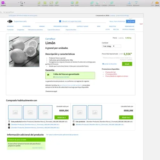
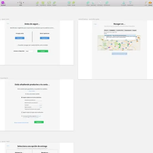
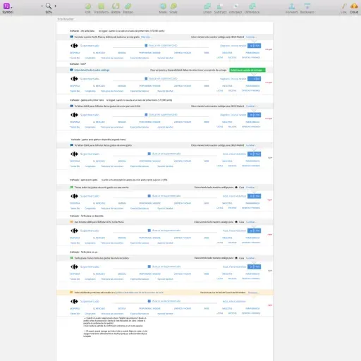
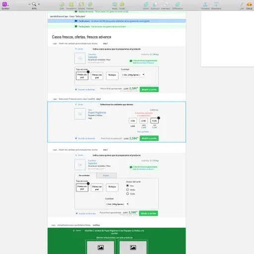
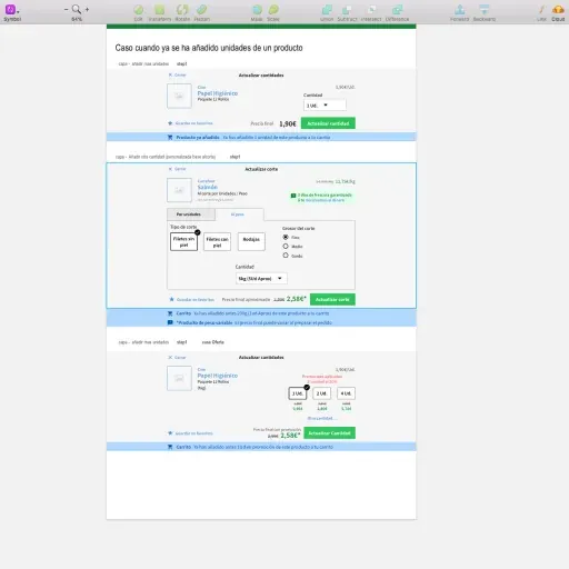
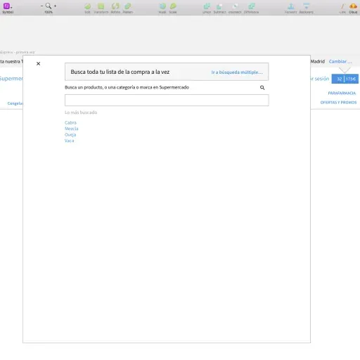
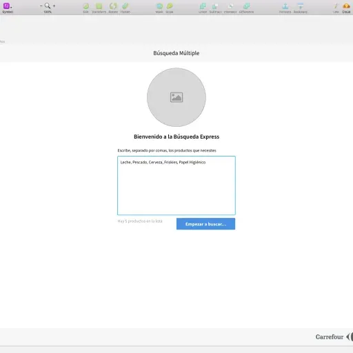
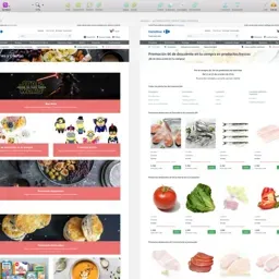
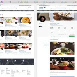
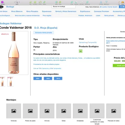
Ground decisions in observed behavior. I led interviews, usability tests, field observations, expert reviews, and competitive benchmarking to identify where the existing experience created friction in discovery, basket-building, and checkout.
-
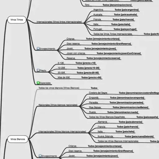
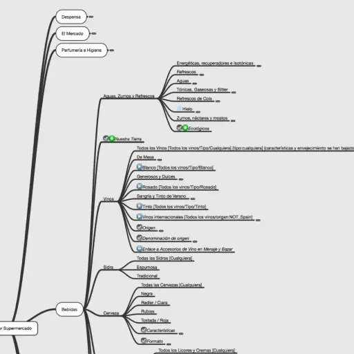
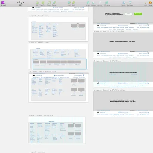
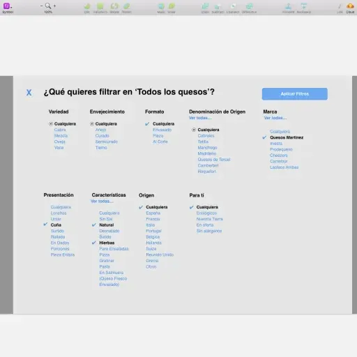
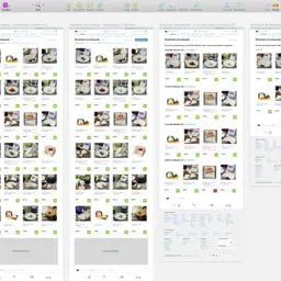
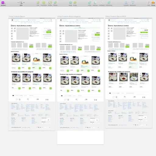
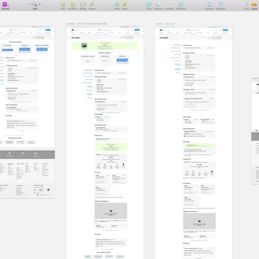
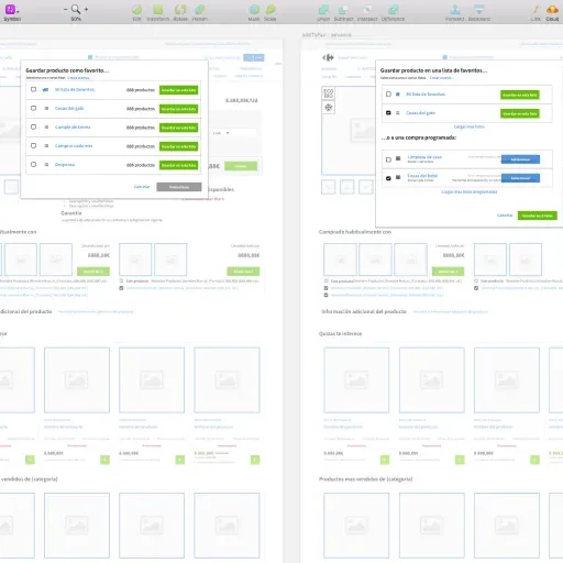
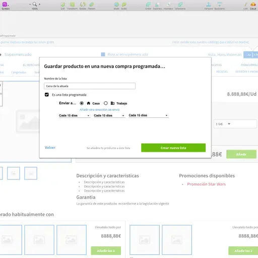
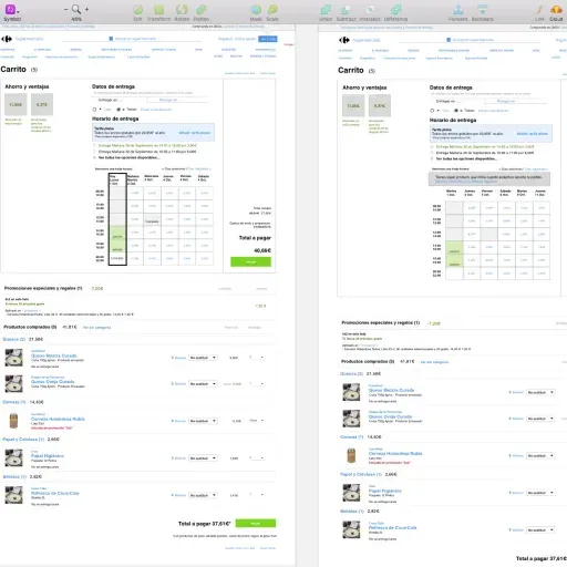
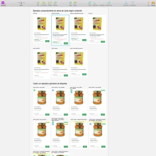
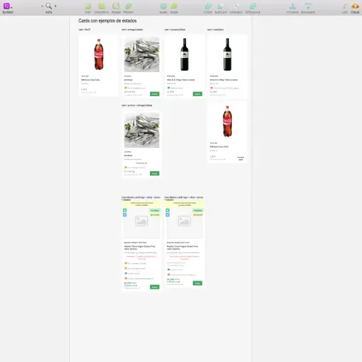
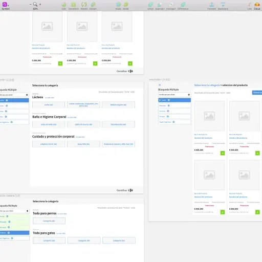
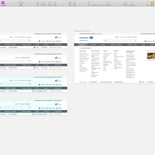
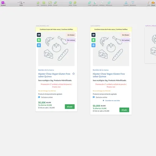
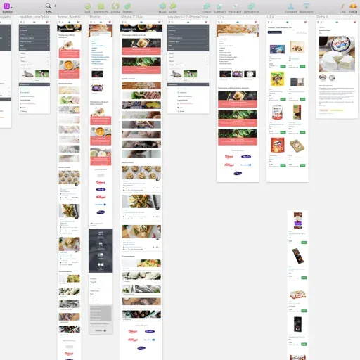
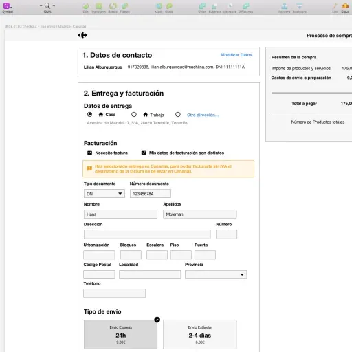
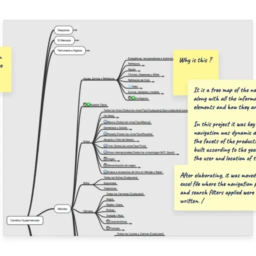
Create structural clarity first. Card sorting and tree testing informed category naming, product grouping, and cross-navigation. That information architecture became a stable foundation engineering could build on while UI details evolved.
-
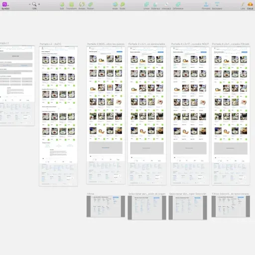
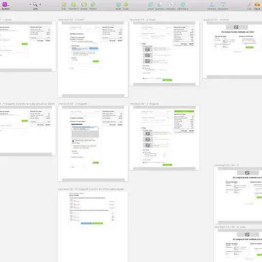
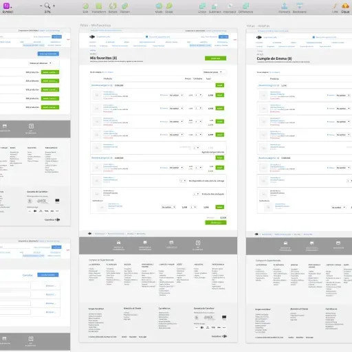
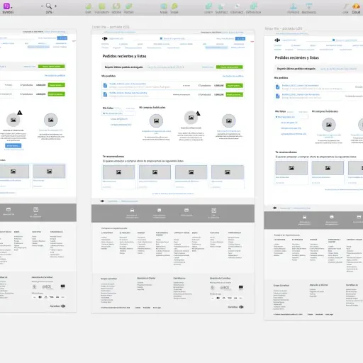
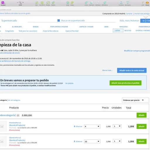
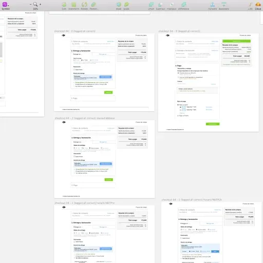
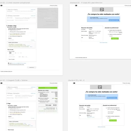
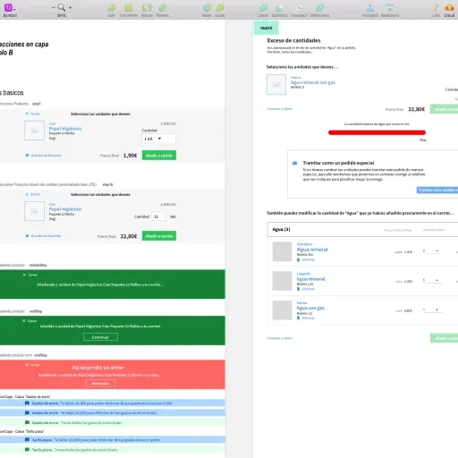
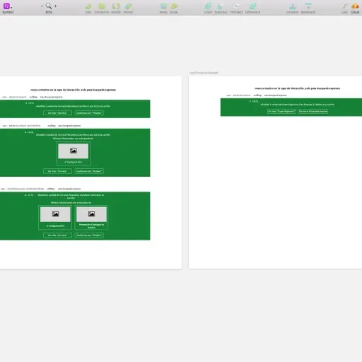
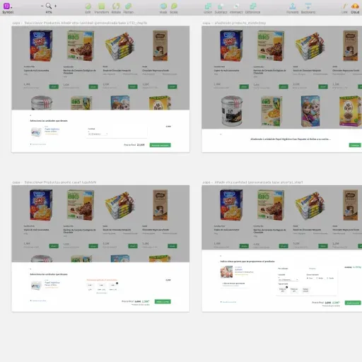
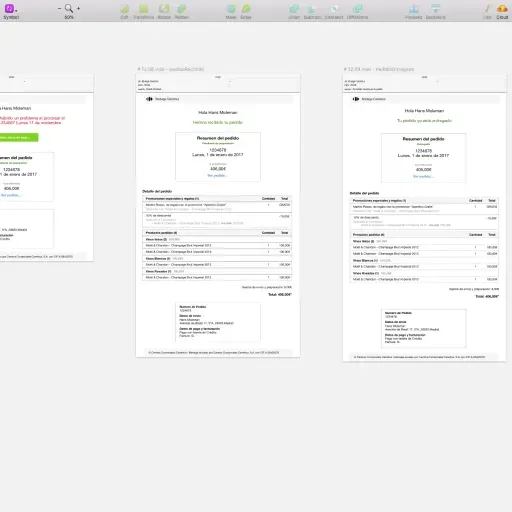
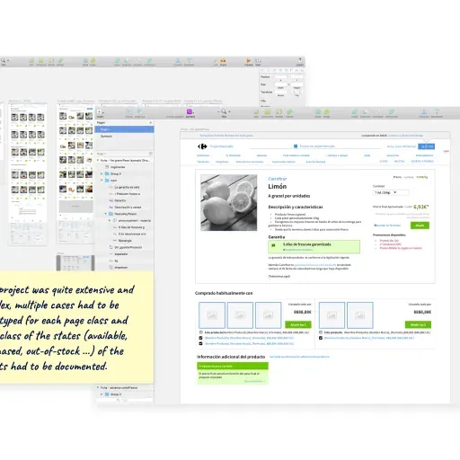
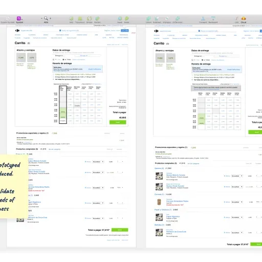
Reduce risk with prototypes. Interactive prototypes let us validate the riskiest flows (search, product discovery, checkout) with real shoppers before committing development time.
-
Make alignment explicit. I facilitated working sessions across marketing, operations, IT, and dev to turn competing priorities into a single, testable roadmap and a clearer design-to-development handoff.
Process at a glance
| Phase | What it de-risked | Output (decision tool) |
|---|---|---|
| Evidence | Where shoppers got stuck in discovery, basket-building, and checkout | Interviews, usability tests, field observations, expert review, benchmarking |
| Structure | Findability and basket routines on a legacy stack | Information architecture (taxonomy + navigation rules) informed by card sorting/tree testing |
| Prototype | The riskiest flows before committing build time | Interactive prototypes + test findings |
| Alignment | Cross-vertical priorities and rollout sequence | Shared roadmap + clearer design-to-dev handoff |
          timeline
Evidence : Observe real grocery shopping
Structure : Fix categories and navigation
Prototype : Test search, discovery, checkout
Alignment : One roadmap across teams
Rollout : Ship in stages on the legacy stack
Key Decisions & Trade-offs
-
Decision: Lead with information architecture (structure) before visual refresh.
- Options considered: UI facelift first; full platform rebuild; information architecture-first with incremental UI changes.
- Criteria used: Safety on a legacy stack, impact on findability/basket routines, and ability to ship in stages.
- Trade-off accepted: Less immediate “new look” in exchange for structural clarity the organization could maintain.
- Resulting implication: A scalable navigation and taxonomy that stayed useful beyond the initial redesign.
-
Decision: Validate flow changes with prototypes + user testing before build.
- Options considered: Expert review only; ship-and-measure; prototype-and-test.
- Criteria used: Cost of rework, risk to conversion, and the confidence multiple stakeholders needed to commit.
- Trade-off accepted: Upfront research time to reduce downstream churn.
- Resulting implication: Decisions anchored in shopper behavior, not internal preference.
-
Decision: Use facilitated alignment to avoid vertical-by-vertical optimization.
- Options considered: Each team owning its slice; centralized decisions without workshops; shared artifacts + decision workshops.
- Criteria used: Time to decision, ownership clarity, and fewer late-stage escalations.
- Trade-off accepted: Time spent negotiating hard trade-offs early.
- Resulting implication: Faster cycles once build started and a clearer handoff to development.
Impact
- Metrics: +20% online sales after launch. Checkout up 12%, abandonment down 15% through research-led iteration.
- Qualitative outcomes:
- Easier product discovery and more predictable category paths.
- Less “hunting” and fewer detours while building a basket.
- Earlier development start and staged rollout through Q1 2018.
What I Learned / What I’d Do Next
In high-stakes retail, a redesign is a coordination problem before it’s a UI problem. A shared information architecture and explicit trade-offs give teams permission to move fast without breaking operations.
Next, I’d tighten measurement around discovery and checkout (search success, navigation backtracks, checkout drop-off) so every change stays tied to a decision and an outcome.
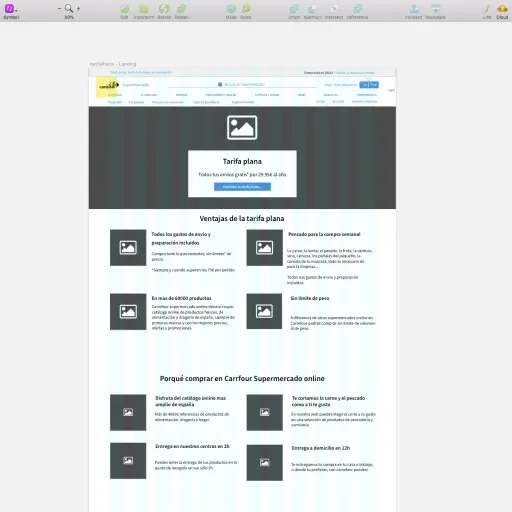
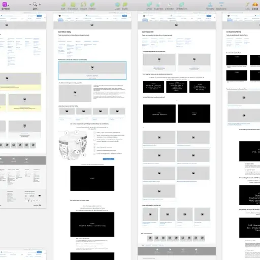
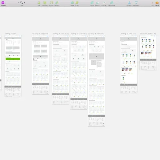
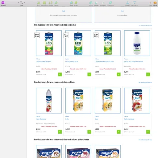
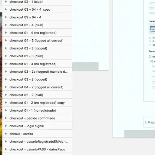
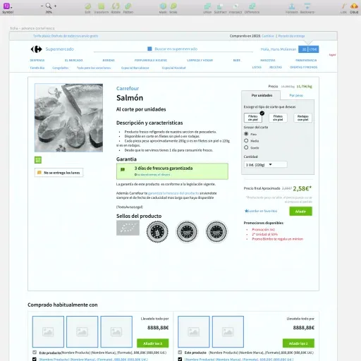
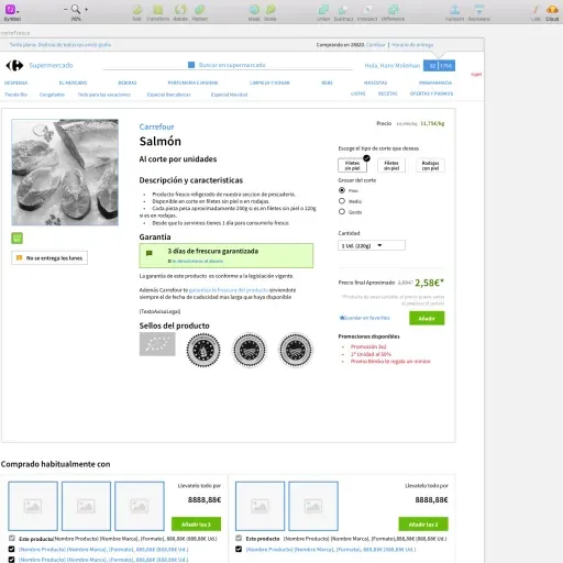
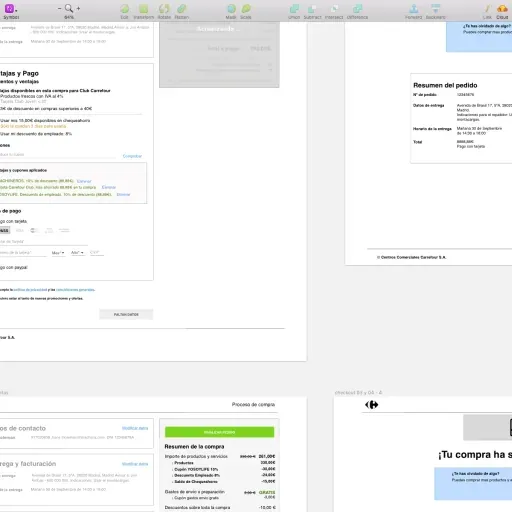
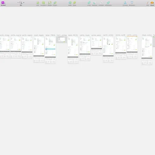
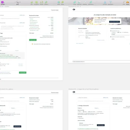
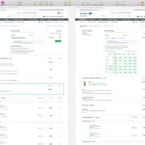
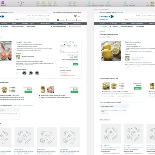
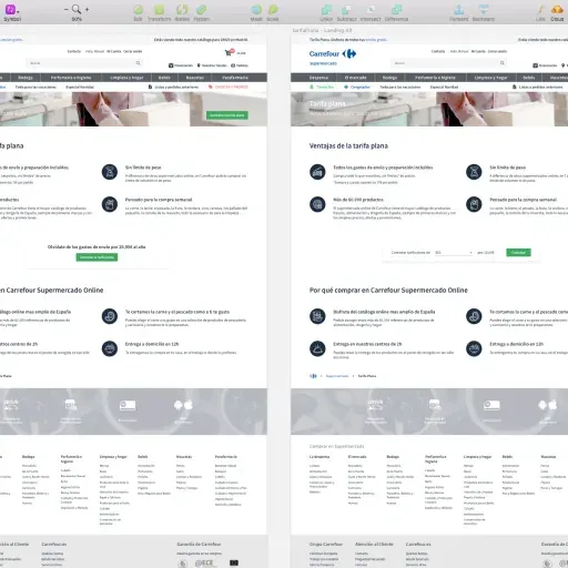
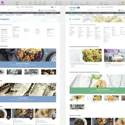
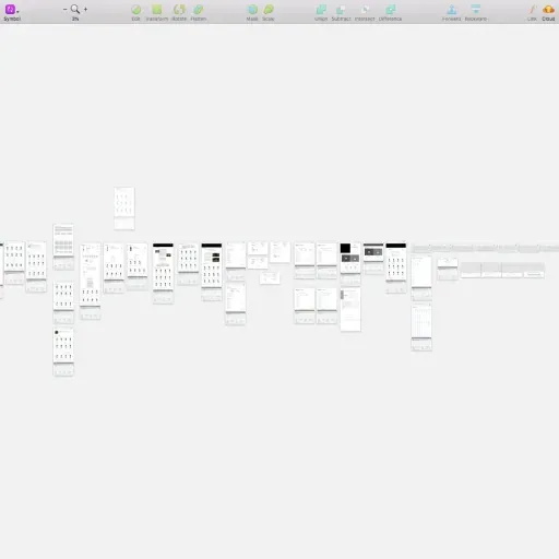
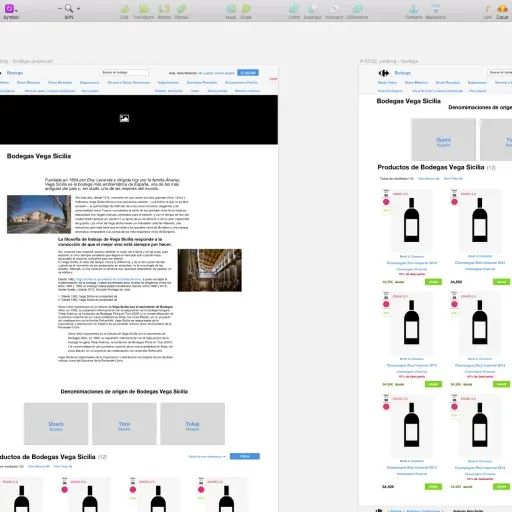
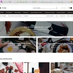
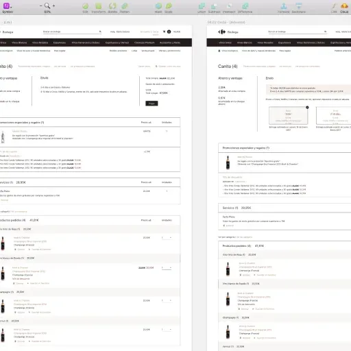
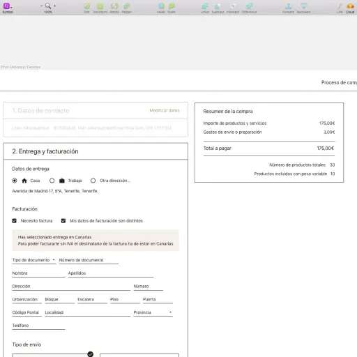
Project Media & Screenshots
Media
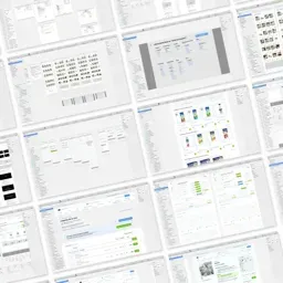
Screenshots