Carrefour Online Supermarket — E‑commerce Redesign (Case Study)
Rebuilt Carrefour Spain’s online grocery experience to make buying food online feel simple, familiar, and fast across a complex retail operation.
+20% online sales after launch by re‑architecting navigation, aligning stakeholders, and testing prototypes with real shoppers.
Role
UX & Service Design Consultant @ Machiina.
Client / Market
Carrefour España, e‑commerce supermarket, Spain.
Timeline
2016–2017 (rollout continued into Q1 2018).
Who might find this case interesting?
Heads of Product/UX in retail & grocery, large-catalog e-commerce teams, and Platform designers who need proof that information architecture (IA) + prototyping lift conversion under legacy constraints. See taxonomy, cross-nav, and scalable IA that supports multi-market organizations.
UX Research leads, Search & Discovery teams, and Checkout/CRO owners seeking evidence-based patterns: card sorting, tree testing, moderated studies, basket-building/list routines, and friction-cutting checkout flows that reduce time-to-buy without rebuilding the stack.
Service Design/Operations leaders, DesignOps owners, and Product Managers aligning marketing, operations, IT, and dev. Learn incremental rollouts, tighter design-to-dev handoff, and how to ship a credible V1 fast—useful for startups and q-commerce too.
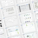
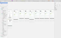
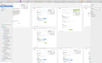
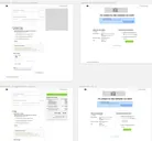
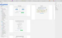
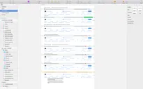
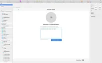
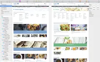
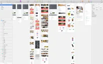
Jump to Project's Media and Screenshots ->
Overview
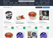
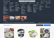
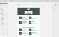
Carrefour España needed to modernize its online supermarket. A fragmented, legacy experience across business verticals made grocery shopping feel heavy and slow.
I joined via Machiina to bring structure and momentum, clarifying goals and aligning marketing, operations, and IT. I also reshaped the end-to-end experience.
We approached this project as more than just a UI refresh. We redesigned the information architecture, flows, and service touch-points to eliminate friction and create a platform that the team could confidently evolve.
Strategic Discovery Focus
How we found the right direction
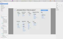
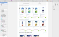
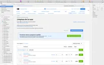
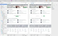
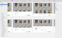
- Research to ground decisions. I led interviews, usability tests, field observations, expert reviews, and competitive benchmarking to understand how people actually shop for groceries online (lists, routine baskets, delivery windows, substitutions) and where the current site created friction.
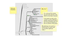
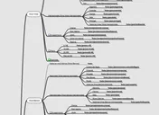
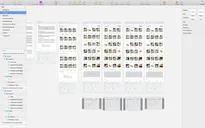
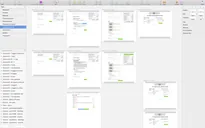
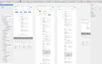
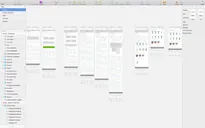
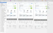
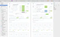
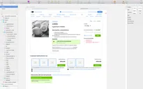
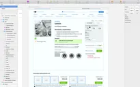
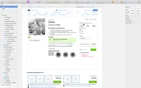
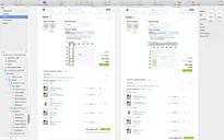
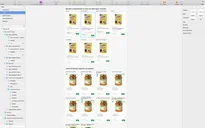
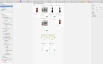
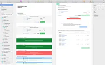
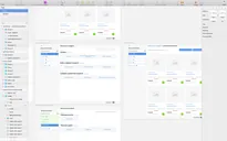
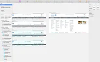
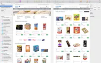
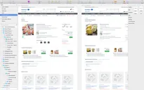
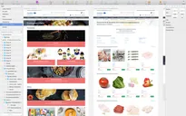
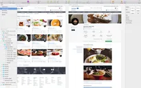
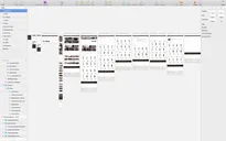
- Card sorting → clearer information architecture. We ran card‑sorting and tree‑testing exercises to inform the site structure. This work guided category naming, product grouping, and cross‑navigation, reducing time‑to‑find.
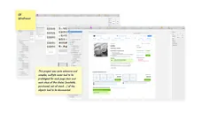
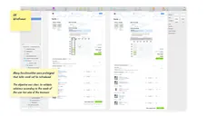
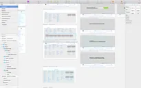
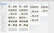
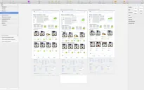
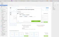
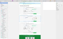
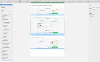
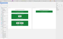
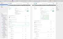
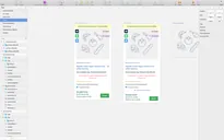
- Prototyping with real users. Interactive prototypes let us validate flow changes early—especially in search, product discovery, and checkout—and iterate quickly with evidence.
- Alignment as a design artifact. I facilitated working sessions across marketing, operations, IT, and Dev to turn competing priorities into a single, testable roadmap. This alignment unblocked decisions and shortened cycles.
Project Constraints
- Legacy platform & tech limits. We had to design within existing back‑end constraints while pushing the front‑end experience forward.
- Multiple business verticals. The online supermarket intersected with promotions, logistics, and content teams—each with different KPIs.
- Delivery under iteration. Development needed to start before the ‘final’ UI was frozen, so we structured work to ship incrementally and keep scope stable.
What we did about it
- Defined the information architecture first (naming, grouping, hierarchical paths) so dev could begin safely while UI details evolved.
- Established a Design‑to‑Development handoff (components, flows, documentation) to reduce ambiguity and rework.
- Used flexible Scrum/Agile cadences to integrate frequent research feedback without derailing timelines.
Approach & Actions
- Measure technical possibilities with engineering to ensure feasibility while still widening UX options.
- User research at retail scale (interviews, testing, reviews, field studies) to pinpoint friction in discovery, basket building, and checkout.
- Bring everyone to the table so business rules and user needs informed one coherent experience.
- Prototype → test → iterate to reduce risk before committing to build.
- Craft the information architecture to speed up finding products, create more predictable paths, and simplify the funnel.
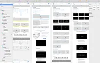
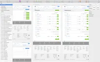
- Design system foundations to support consistent UI and faster delivery.
Outcome
- +20% online sales. A measurable uplift following launch.
- Easier to shop. Customer feedback indicated a more straightforward, useful experience—less hunting, fewer detours.
- information architecture that lasts. Visual trends change; a solid information architecture continued to support future evolution.
- Faster delivery: The structured information architecture, documentation, and early component work let development start earlier and ship in Q1 2018 via staged releases.
My Contribution
- Led discovery (research plan, studies, synthesis), information architecture, journey mapping, and prototyping.
- Facilitated cross‑functional alignment (marketing, operations, IT, dev) and decision workshops.
- Defined design artifacts and handoff practices (flows, components, documentation) to de‑risk development.
Tools & Methods
Methods: Usability testing, expert reviews, user reviews analysis, field studies, card sorting, benchmarking, low/high‑fidelity wireframes, early design system, flexible Scrum/Agile, Design‑to‑Dev handoff.
Tools: Sketch, InVision, Zeplin, MindNode, Excel, Keynote/Word.
Type of Company Fit
Enterprise retailer, B2C e-commerce, complex, multi-stakeholder environment.
This project demonstrates how I help large organizations move faster by aligning stakeholders, reducing risks with research, and implementing improvements iteratively.
Lesson Learned
When stakes are high and teams are many, start with structure. A clear information architecture and aligned roadmap give everyone courage to change—and results that stick.